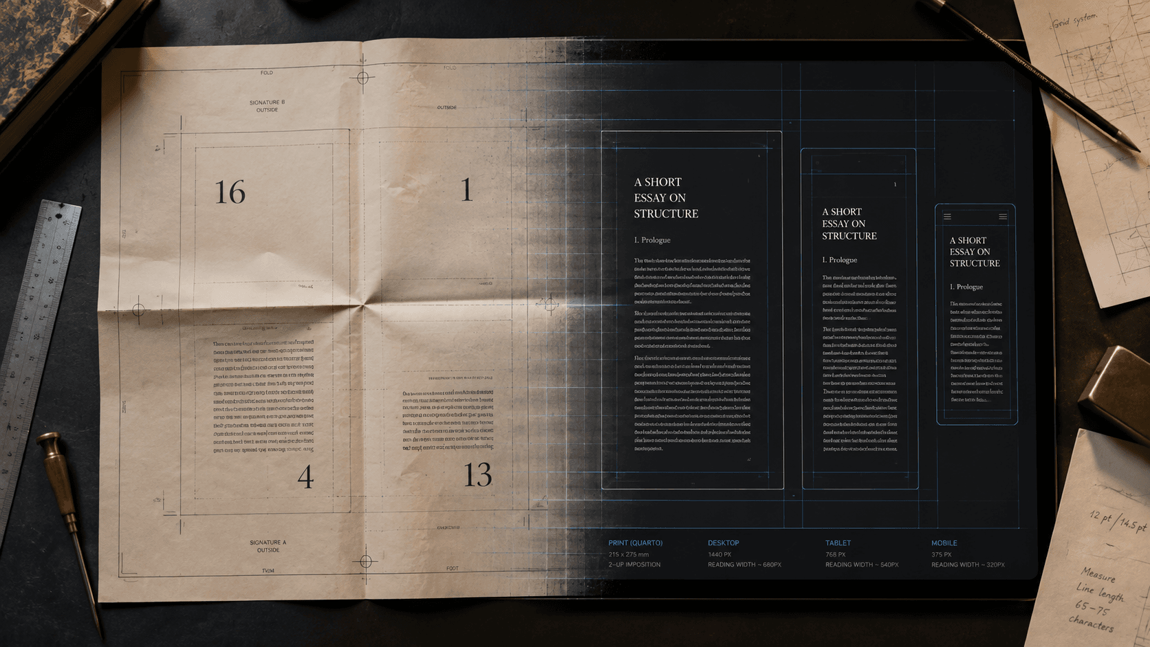
A printer setting a quarto does not see pages in the order a reader will. Several pages are arranged together on a sheet, some upside down, so that folding and binding will put them into sequence. The surface called page four during reading may sit beside a much later page during production. To the compositor it is an area to be imposed; to the binder, part of a folded gathering; to the reader, a numbered place.
This is one reason the page is difficult to discuss. The word appears to name a plain physical thing, yet it also names a composition, an address, a unit of sequence, a field for annotation, and, in software, a temporary view. These functions have traveled together for so long that the bundle feels natural. Digital publishing loosens the bundle. A book can keep its order and lose its fixed line endings. It can keep headings and links while surrendering stable page numbers. A reading system can create screen pages that vanish when the reader enlarges the type. Asking which work the page was doing is more useful than asking whether digital books need pages at all.
The material surface
Bibliographers distinguish a leaf from a page. A leaf has two sides, recto and verso. Foliation gives the leaf one number and identifies the side; pagination gives each side its own number. The distinction is modest until a manuscript lacks stable numbering, a leaf has been moved, or an editor has to describe exactly where an addition appears. Then the address becomes an argument about the object.
The Newton Project makes this visible in its editions of Isaac Newton's papers. A diplomatic transcription preserves such evidence as cancellations and additions, while a normalized text makes the words easier to read. Editors sometimes have to supply page identifiers where original foliation is inconsistent. The resulting views answer different questions. One helps a reader follow a text; another helps a scholar inspect an event on a particular surface. Neither is a neutral substitute for the other.
Long before modern print, makers used the page to expose structure. Headings, initials, paraphs, running heads, glosses, and reference signs helped readers recognize where they were and how one passage related to another. These devices were neither inevitable nor uniform. Their forms varied by period, place, genre, expense, and expected use. What they share is the treatment of the page as a field designed for more than a stream of words.
Printing enlarged the page's responsibilities. It did not deliver every familiar convention at once. Early printers carried many manuscript practices into type and gradually adapted title pages, numbering, indexes, and other apparatus over decades. At the same time, imposition made each reading page part of a production geometry invisible in the finished book. The page coordinated intellectual sequence with paper, press, fold, and binding.
Six jobs inside one rectangle
A page composes. It fixes line length, breaks, margins, the relation of text to image, and the amount a reader encounters at once. A line ending in a printed poem can carry meaning; a line ending in a prose novel is usually a consequence of measure.
It also bounds. The edge turns an indefinite stream into a succession of manageable fields. A reader can scan one spread, recognize a paragraph near the foot, or recall a table by its position in a particular edition. Such experience does not establish a universal cognitive advantage for fixed pages, but it shows how spatial location can participate in reading.
Binding gives the page sequence. Turning a leaf is movement through both object and work, making some transitions immediate and others remote.
Numbering gives it an address. “Page 147” lets two people with compatible editions point to the same place. The qualification matters. A page number belongs to a setting. A paperback, hardback, large-print edition, and translation can give the same passage four different addresses.
Geometry stages relationships. Notes can sit below the passage they qualify; captions can stay beside figures; a facing-page translation can answer its source line by line. Here position may be part of editorial structure rather than decoration.
The surface also records. A stain, erasure, correction, torn edge, or reader's mark belongs to a location on a particular object. A transcription can preserve what the mark says while losing much of how it sits among other traces.
No publication needs every function in the same degree. Confusion begins when one function is defended as though it required the whole bundle.
The page after geometry
PDF and reflowable EPUB make the separation unusually clear. PDF's design center is a described page. It aims to preserve a final-state composition across systems, although a well-made PDF can also contain headings, logical structure, links, metadata, and accessibility information. Its strength is not that it is visual only; it gives geometry unusually strong authority.
A reflowable EPUB encodes structured publication content and asks the reading system to compose it for the current conditions. The reader may change font, size, spacing, theme, or orientation. A narrow phone and a wide tablet produce different lines and screen pages from the same content. The EPUB still has a default sequence, machine-readable navigation, headings, links, and identifiers. What it lacks is one mandatory set of publisher-defined page boundaries.
Generated pages are useful rather than fraudulent. They perform bounding and pacing for the current session. They are poor shared addresses because they can change with settings. A percentage, location, heading, or linked fragment can serve some addressing tasks instead. Each replacement has limits. Percentages are coarse; generated locations may be platform-specific; headings do not identify every sentence; fragment identifiers are often invisible to readers. Some systems use continuous scroll instead of temporary pages, preserving order without a page-turning rhythm.
Reflow transfers part of composition from publisher to reading system and reader. This can improve access, especially when larger text and different spacing are necessary. It can also break designs whose meaning was never distinguished from their coordinates.
When position is meaning
Some works need fixed geometry. A facsimile edition may preserve the page as evidence. A comic may depend on panel size, adjacency, and reveal across a spread. A mathematical figure can fail if labels become detached from the parts they name. A scholarly edition may require stable citation to a source pagination.
Even here, fixing the page does not finish the book. A fixed-layout EPUB still needs coherent reading order, navigation, and alternatives for readers who cannot use the visual arrangement. A PDF still needs structure if it is to work beyond sighted page viewing. Preserving one function can expose the need to rebuild another.
Other works inherit fixed geometry without needing it. A conventional prose manuscript may contain forced page breaks, headers, and carefully adjusted blank lines because its author has used the word processor as a preview of print. Those choices answer how this draft should look on this screen. They may say little about the chapter's structure or how it should behave as an ebook.
The distinction gives editors a practical test. If a boundary changes, does the meaning change? If line endings move, are they merely recomposed or editorially damaged? Does a reference require a shared page, or could a named section and stable link do better? Is a facing relationship essential, useful, or inherited from an earlier edition? Which marks belong to the work, and which belong to one physical witness?
A page is a remarkably successful coordination device, joining material, sequence, address, composition, and memory in one place. Digital publishing makes those agreements negotiable. A later interface may discard the rectangle, but it still has to account for the work the rectangle was doing.
SOURCES
- Library of Congress. “Differences between Manuscripts and Incunabules.” https://guides.loc.gov/manuscript-facsimiles/differences-manuscripts-incunabules - Library of Congress. “Don't Get Out of Sorts: Composing Text.” https://blogs.loc.gov/bibliomania/2025/01/15/dont-get-out-of-sorts-composing-text/ - Wakelin, Daniel. “Designing the Page.” Cambridge University Press. https://www.cambridge.org/core/services/aop-cambridge-core/content/view/DFAC91EC629BB141D17859CA7EEA70B0/9780511976193c4_p79-103_CBO.pdf/designing_the_page.pdf - The Newton Project. “A Short Scheme of the True Religion.” https://www.newtonproject.ox.ac.uk/view/texts/normalized/THEM00138?end=par23&start=hd4 - W3C. EPUB 3.3. https://www.w3.org/TR/epub-33/ - Library of Congress. “PDF Family, Portable Document Format.” https://www.loc.gov/preservation/digital/formats/fdd/fdd000030