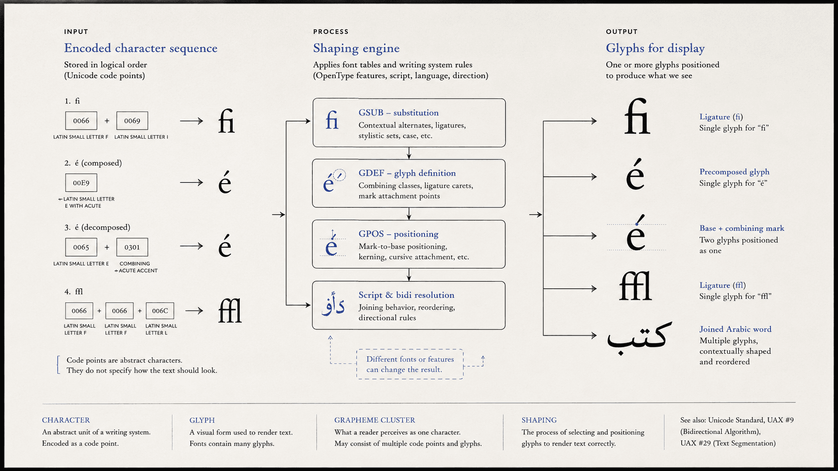
In a well-made font, the letters *f* and *i* may draw together as a single ligature. The reader sees one joined shape. Select it, copy it, and paste it into plain text, and two characters usually remain. The shape has changed; the text has not.
That small event contradicts one of computing's durable folk models: one key produces one character, each character has one picture, and a row of pictures makes a word. The model fails even in familiar Latin typography. Combining accents and contextually shaped scripts make the failure impossible to overlook.
Digital publishing depends on keeping several terms apart.
Four useful levels
A character is an abstract element of a writing system: a letter, digit, punctuation mark, or another encoded unit. Unicode assigns encoded characters to numerical positions called code points. U+0041 identifies LATIN CAPITAL LETTER A; it does not require that A to have a particular serif, width, stroke contrast, or visual voice.
A grapheme cluster is a sequence that approximates what a user perceives as one character for cursor movement and selection. An accented letter may consist of a base character followed by a combining mark. Some emoji and script units contain several code points while behaving as one visible unit. Language-specific expectations can be more complex than Unicode's default boundaries.
A glyph is a form used to render text. A font contains glyphs and information about how they can be substituted or positioned. Its A can differ radically from another font's A while representing the same character.
These levels do not form a perfect nesting hierarchy. One character can use several glyphs according to context; one glyph can represent a sequence of characters; one grapheme cluster can contain several code points. The distinctions are tools for locating work, not four boxes into which every writing system fits neatly.
The file stores identities, not drawings
Unicode encodes characters rather than the particular images used to display them. That familiar division explains how changing a font can transform letterforms without rewriting the text. It also enables one source to work at several sizes, on multiple devices, through speech and braille, and in contexts whose final typeface was unknown when the text was created.
The relation is many-to-many. A font may provide upright, swash, proportional, tabular, or context-specific glyphs for one character. A ligature glyph can represent several characters. Some glyphs have no direct Unicode mapping because they are components, ornaments, or intermediate forms used during composition.
Glyph identifiers are local to a font. Glyph 37 in one file need not mean what glyph 37 means in another. If a document preserves only those identifiers without a reliable relationship to characters, it can retain the look of text while making the words difficult to search, copy, speak, translate, reflow, or preserve.
One visible unit can have several encodings
An accented letter can sometimes be stored as one precomposed character and sometimes as a base letter followed by a combining mark. Unicode normalization defines relationships among canonically equivalent sequences so systems can compare and process them more consistently. The displayed result can be the same while storage differs.
This matters in ordinary editorial work. A character count based on code points may disagree with what a writer sees. Search can fail if text is inconsistently normalized. A diacritic can detach when software truncates a sequence incorrectly. A cursor can enter a cluster and leave the insertion point somewhere no reader understands as a character boundary.
Normalization is not a command to flatten every difference. Canonical normalization can improve consistency among equivalent sequences. Compatibility normalization can change distinctions a scholarly, archival, or technical text may need. A transformation should have a purpose and provenance.
A font is a conditional system
OpenType fonts can contain layout tables telling a shaping engine how to substitute and position glyphs. The GSUB table supports alternates, ligatures, contextual forms, and other substitutions. Positioning tables adjust marks and relationships. Script and language information help select appropriate behavior.
Arabic offers a clear example without being an exception to a supposedly normal Latin system. Many letters take forms according to whether and how they join neighboring letters. The underlying characters remain in logical reading order. A shaping engine, using the font's data, chooses contextually appropriate glyphs and positions them. Storing isolated visual forms as if they were the text would make editing and search brittle.
Indic scripts can require reordering and composition in which visible sequence does not correspond to a naive drawing of code points. Combining marks in many scripts require attachment points. Latin typography itself uses kerning, contextual alternates, mark positioning, and ligatures. Shaping is how encoded text becomes readable form.
Responsibility is distributed. Unicode defines characters and properties. The application supplies text, language, direction, and style. A shaping engine interprets script behavior. The font provides glyphs and layout data. The renderer places the result on screen or page. A failure can occur at any layer, which is why “the font is broken” is sometimes correct and often premature.
When correct appearance is the wrong test
A scanned page can look perfect and contain no text data. A PDF can display recognizable words while its internal character mapping is missing or wrong. Copying a sentence then produces nonsense because the viewer knows which glyphs to paint but not which characters they represent.
These files pass visual inspection and fail other publication tasks. Search operates on characters or derived text. Screen readers need encoded content and order. Braille translation applies rules to language and characters. Reflow requires text that can be segmented into words and lines. Preservation needs enough information to interpret the file outside one rendering environment.
The reverse problem occurs too. Correct Unicode text can display boxes, detached marks, or malformed words because the font lacks coverage, the shaping engine lacks support, or language and direction are misidentified. The text has survived, but the current system cannot render it adequately. Character correctness and glyph correctness are separate tests.
A diagnostic order for publishers
When copied text turns to gibberish, ask whether the file contains characters with a usable mapping. When accents or conjuncts break, inspect normalization, language, shaping support, and font coverage. When a ligature seems to interfere with search, determine whether the underlying text contains an ordinary character sequence or a compatibility ligature character. When an editor inserts a mark using a symbol font, verify that the stored character actually represents the intended symbol.
Publish semantic characters where they exist. Do not encode desired appearance by substituting an unrelated character whose glyph happens to look right in one font. Declare language and direction. Preserve source text separately from outlined display art. Embed and license fonts appropriately when exact appearance is significant while retaining a meaningful text layer for access and recovery.
The broader tool principle is restrained: preserve semantic text, then let presentation adapt through declared rules. A publishing system should allow typeface, size, device, and reading mode to change without changing what the characters are.
The reader still sees the glyph
The character–glyph distinction should not demote typography. Readers encounter shaped language, not abstract code points. Shape carries hierarchy, tone, legibility, genre, and cultural knowledge. A correctly encoded string rendered with an incomplete or inappropriate font is not a successful publication.
The distinction protects typography by locating its work accurately. A glyph can join, contrast, alternate, and respond to context because it is not forced to serve as the permanent identity of the character. The text can remain stable while its visible expression becomes specific to language, medium, and reader.
The joined *fi* is evidence of that agreement. Two stored characters become one perceived form and return intact when copied away. Meaning and appearance have cooperated without being mistaken for each other.
SOURCES
- Unicode Consortium. The Unicode Standard, Version 17.0, Chapter 2. https://www.unicode.org/versions/Unicode17.0.0/core-spec/chapter-2/ - Unicode Consortium. “Unicode Glossary.” https://www.unicode.org/glossary/ - Unicode Consortium. UAX #29, “Unicode Text Segmentation.” https://www.unicode.org/reports/tr29/ - Unicode Consortium. UAX #15, “Unicode Normalization Forms.” https://www.unicode.org/reports/tr15/ - Microsoft Typography. OpenType 1.9.1, “Glyph Substitution Table.” https://learn.microsoft.com/en-us/typography/opentype/spec/gsub - Microsoft Typography. “OpenType Overview.” https://learn.microsoft.com/en-us/typography/opentype/spec/overview