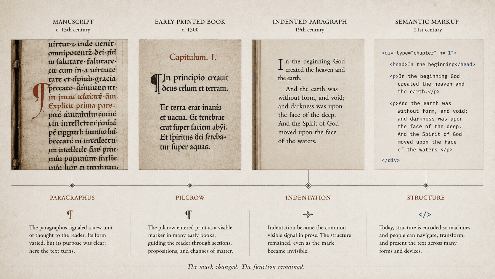
Turn on “show formatting marks” in a word processor and a pilcrow appears at the end of every paragraph. It looks like exposed machinery, something the application hides once the document is presentable. Centuries earlier, related signs were part of the reader-facing page. They did not reveal a concealed instruction; they told the reader that the text had turned.
The same mark has occupied both sides of publishing: visible navigation and invisible structure. That history makes the modern rectangular paragraph look less inevitable.
A division can precede its sign
Medieval manuscripts could signal textual divisions with a paragraphus, a pilcrow-like sign, a colored initial, a line break, reserved space, or a combination of these. Forms varied across regions and periods, and the units they marked did not always coincide with a modern prose paragraph. A sign might introduce a new proposition, speaker, section of argument, or another meaningful turn.
Production sometimes separated the division from its final appearance. A scribe copied the principal text while reserving spaces for initials or paragraph signs. A rubricator could add marks later in colored ink. Where that stage was not completed, blank spaces remained inside the column. The page preserved evidence that a boundary had been planned even though its intended visible form was absent.
This workflow has encouraged an appealing origin story: rubricators failed to fill the spaces, readers accepted the gaps, and indentation was invented by accident. The story is too neat. Empty spaces, outdents, indents, initials, and marks developed in varied combinations. A gap in one manuscript may reflect cost, schedule, correction, convention, or incomplete work. The stronger evidence lies in the division of responsibility. Textual grouping existed before another worker made it visible.
The modern pilcrow preserves one descendant of these signs. Unicode encodes PILCROW SIGN as U+00B6, while scholars have proposed additional characters for historically distinct paragraphus forms. Encoding the familiar symbol does not reduce every old sign to a decorative variation. A character standard must decide which differences belong to typographic rendering and which have documented identities of their own.
What kind of unit is a paragraph?
A long literary paragraph may extend for a page; a line of dialogue may occupy three words. One sentence can be a paragraph. A list can interrupt a sentence whose rhetorical movement continues afterward. These cases reveal that “paragraph” can name at least two units: a movement a reader understands and a structural container a publishing system can encode.
The current HTML standard makes the complication explicit. A `p` element cannot contain a list element. If a sentence begins in prose, continues through a list, and concludes afterward, HTML represents several structural paragraphs even when a reader perceives one continuous grammatical unit. The standard calls attention to the mismatch instead of pretending markup has settled literary form.
This is not a defect in semantic publishing. Machines require workable boundaries for styling, navigation, transformation, and accessibility. The error would be to mistake that implementation for a complete theory of prose. Editors need both perspectives: the rhetorical movement that gives the paragraph meaning and the structural units through which formats carry it.
The block is one rendering
Print did not replace paragraph signs with indentation in one clean transition. Early printed books inherited manuscript conventions, and printers used pilcrows, initials, spacing, and line treatment according to shop, genre, and period. An indented first line eventually became an efficient way to announce a division without consuming a full blank line or requiring a separate visible character.
The familiar book paragraph followed: a block of type, often indented at its beginning and followed immediately by another. Contemporary web pages frequently use vertical space instead, especially where shorter blocks benefit from visible separation. Both conventions expose boundaries. Neither defines what the boundary means.
Combining a strong first-line indent with a full blank line can feel redundant in continuous prose because two systems announce the same change. There are settings in which both are useful and traditions in which neither is the default. The decision belongs to typography, genre, and reading conditions. It does not determine whether the text contains paragraphs.
Presentation still affects interpretation. A large vertical gap can imply a scene break rather than an ordinary paragraph. Weak separation can make speakers difficult to track. A hanging treatment can turn a definition or bibliography entry into another recognizable object. Structure and presentation should be distinguished without pretending that readers encounter structure directly.
The paragraph in a machine
The HTML standard says that the `p` element represents a paragraph. It then offers an unusually historical observation for a technical specification: visual media commonly render paragraphs as separate blocks, but a style sheet or user agent could just as legitimately mark their boundaries with inline pilcrows.
The element identifies a structural unit. CSS and the reading system decide whether its boundary becomes an indent, gap, symbol, or presentation adapted for another reading mode. EPUB uses the same family of web technologies. Its paragraphs can survive changes in typeface, size, line spacing, theme, and screen width because the file does not need to store the default rectangle as manual spaces and returns.
The semantic element also supports transformations that a visual block cannot guarantee. A braille edition can apply tactile formatting. A speech system can pause at a meaningful boundary. An editor can restyle all body paragraphs without altering quoted verse. A validator can identify content placed where a `p` element cannot legally contain it.
No tag decides whether a paragraph is good, where a novelist should break thought, or how much white space a reader needs. It preserves a claim made by the publication: these words belong to a unit of this kind.
Why blank returns are a fragile imitation
An author presses the space bar five times to create an indent, hits Return twice to separate paragraphs, or inserts empty paragraphs until a chapter reaches a new page. The current window looks correct because text characters are being used as layout material.
Change the typeface, page width, export format, or reader settings and the geometry moves. Repeated spaces can collapse in HTML. Empty paragraphs can create erratic reflow or unwanted pauses in assistive technology. Forced returns can strand a heading or create blank screens. The visible failure arrives late, but the structural mistake happened during authoring.
Paragraph styles supply a more durable instruction. The author marks body text, quotation, dialogue, heading, or another role. The style supplies appropriate indentation, spacing, and pagination rules for the output. A print edition can indent continuous prose while a web edition uses block spacing and a braille edition follows tactile conventions. The source retains grouping rather than one imitation of a page.
This does not require authors to think in raw tags. It requires tools to distinguish “begin another unit of this kind” from “insert blank width until the screen looks right.” Good authoring software makes the structural action easy and lets formatting marks remain available for inspection.
What the pilcrow now reveals
The pilcrow at the end of a word-processing paragraph marks a control character rather than appearing in the published text. Editors reveal it temporarily to find doubled returns, missing breaks, tabs, and improvised layout. The old manuscript sign did the reverse: it appeared to ordinary readers as a guide inside the text.
One sign now remembers both arrangements. It can be a visible boundary or evidence of one hidden in the file. Neither use makes the pilcrow the paragraph. It shows that a stream of language has been divided and that someone, somewhere in production, must decide how the reader will know.
SOURCES
- WHATWG. HTML Living Standard, “The p Element.” https://html.spec.whatwg.org/multipage/grouping-content.html#the-p-element - Unicode Consortium. The Unicode Standard, Version 17.0, Chapter 6. https://unicode.org/versions/Unicode17.0.0/core-spec/chapter-6/ - Unicode Consortium. “Proposal to Add Two Medieval Characters.” https://www.unicode.org/L2/L2016/16235-two-medieval-chars.pdf - Parkes, M. B. Pause and Effect: An Introduction to the History of Punctuation in the West. University of California Press. - Oxford Academic. “Dramatic Pilcrows.” https://academic.oup.com/book/40557/chapter-abstract/347915906 - University of Saskatchewan. ArchBook, “The Page.” https://drc.usask.ca/projects/archbook/thepage.php