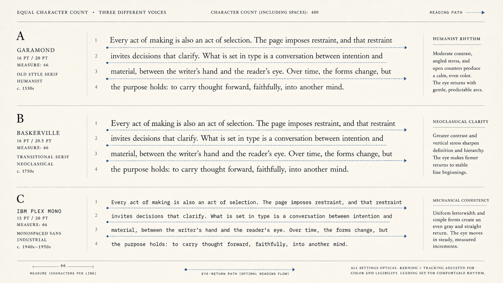
Typography advice likes a number. Set prose between this many and that many characters per line, and a difficult decision appears to become measurable. The number is useful because a line can indeed be too long to track comfortably or so short that frequent returns and broken phrases disrupt reading.
Its precision is also misleading. Sixty characters of a narrow typeface occupy a different measure from sixty characters of a wide one. A language with long compound words creates different spacing from one with many short words. Larger type, leading, justification, column width, viewport, and reader vision all participate. Even the outcome called readability may mean speed, comprehension, preference, fatigue, error, or the ability to keep one's place.
What the count counts
Characters per line is a proxy for the distance and density a reader encounters before returning to the next line. It is attractive because characters can be counted across print and screens. It does not describe the physical width of the glyphs, the size at which they are set, the spaces between words, or the vertical distance of the return. A line emerges from these systems together rather than from its character count alone.
Consider two imaginary lines with the same count. One uses a condensed face with small type and tight leading. The other uses a broad face with larger type and open leading. The count declares them equal while the eye meets different textures and distances. Full justification adds another variable by distributing space to make both edges align. Short measures can produce conspicuous gaps or frequent hyphenation; long measures can turn the return sweep into a search for the next line.
Words per line is no universal rescue because languages and texts have different word lengths. Inches, picas, or CSS pixels describe a surface without saying how many signs occupy it. The CSS `ch` unit is tied to the advance measure of the zero glyph, not an average of every character in the text. Every metric answers one part of the design.
The count is most honest when used as a diagnostic. It says that a setting may impose a long tracking distance; it cannot by itself certify readability.
A study is a set of conditions
In a 2001 experiment, Mary Dyson and Mark Haselgrove studied screen reading under specified line-length and reading-rate conditions. A medium line length of 55 characters supported effective reading in that setup, while outcomes differed across speed, comprehension, and scrolling behavior. The value is worth knowing and unsafe to promote into a universal optimum.
An experiment samples people, texts, tasks, displays, and measurements. Change the question from rapid reading to close comparison, or the population from typical adult readers to people using magnification, and the design problem changes. Preference can diverge from performance. A setting that supports speed may not support sustained comfort or comprehension. Studies that seem to disagree may have measured different effects.
Craft recommendations work differently. A typographer's preferred range condenses experience with particular kinds of text and composition. It can be a strong starting point without becoming experimental proof. The responsible designer keeps the provenance of the number: standard, study, house rule, or practiced judgment.
A systematic review of typeface and legibility research indexed by PubMed found no universally most legible typeface. Results depend on population, medium, size, task, and method. Type choice remains consequential; “most legible” remains incomplete until its conditions are named.
What WCAG actually says
WCAG 2.2 Success Criterion 1.4.8, Visual Presentation, includes a width of no more than 80 characters or glyphs, or 40 for CJK text. The apparent exactness has produced a common misreading.
The criterion is Level AAA. It requires a mechanism to be available to achieve the specified presentation conditions; the content does not always have to be permanently typeset at those values. The mechanism may be supplied by the browser or another user agent. The same criterion addresses selectable colors, removal of full justification, line and paragraph spacing, resizing, and avoidance of horizontal back-and-forth scrolling under stated conditions.
Its purpose is access. Some readers with low vision or cognitive, language, and learning disabilities have difficulty tracking long lines or finding the next one. Reader control allows a person to choose conditions that support perception. The figure 80 acts as a maximum achievable width in that framework, not a recommendation that every novel should default to 79 characters.
The distinction matters because accessibility and house typography answer overlapping questions from different positions. A publisher chooses a considered default. An accessibility criterion protects the reader's ability to alter presentation. A narrow default that cannot enlarge or reflow may fail readers despite its fashionable measure.
Print settles; screens continue negotiating
A print designer chooses page size, margins, typeface, type size, columns, leading, and justification. Once printed, the line is fixed. Testing can still be empirical: make specimens, read at intended size, inspect spacing and hyphenation, ask representative readers, and consider the conditions in which the book will be used. The finished choice is one negotiated setting made permanent for that edition.
A responsive page or reflowable EPUB supplies a range. The publisher sets defaults and constraints; the viewport and reading system apply them; the reader may change type and spacing. Rotate a device and the measure changes. Enlarge the font and fewer characters fit. A good design does not hold one ideal line at all costs. It keeps the relation usable across plausible settings.
This is where maximum width controls are valuable. On a wide screen, allowing prose to stretch from edge to edge creates lines no default type can rescue. On a narrow screen, forcing a fixed text column can require horizontal scrolling. Relative dimensions and reflow let the block respond while a sensible maximum protects the broad view.
Reader styles can override publisher choices, especially in EPUB. That does not excuse a poor default. Many readers use the book as delivered, and some reading systems expose limited controls. The publisher should make the first setting hospitable and avoid CSS that prevents readers from improving it.
A defensible decision
Begin with the reading task. Continuous narrative, reference lookup, data comparison, captions, poetry, and instructional steps use lines differently. Identify the audience and likely viewing conditions. Choose a typeface and size before treating character count as meaningful. Set a provisional measure and leading together.
Then inspect outcomes rather than only the count. Can the eye find the next line? Are word spaces coherent? Does full justification create rivers or collisions? Are hyphens frequent enough to change the texture? Does enlarging text preserve reflow? What happens with the narrowest and widest expected viewports? Can the reader alter the presentation?
Use a familiar heuristic to produce a first specimen, then earn the final setting through context. If a requirement supplies an exact threshold, read its conformance level, scope, and notes. If a study supplies a number, keep its task and population attached. If a respected designer supplies a range, call it practiced advice.
The objective is a line whose compromises suit the publication: long enough for phrasing, short enough for tracking, spacious enough for word recognition, adaptable enough for readers, and stable enough for the form. A character count becomes useful when its source and intended outcome stay attached.
SOURCES
- W3C Web Accessibility Initiative. “Understanding Success Criterion 1.4.8: Visual Presentation.” https://www.w3.org/WAI/WCAG22/Understanding/visual-presentation.html - Dyson, Mary C., and Mark Haselgrove. “The Influence of Reading Speed and Line Length on the Effectiveness of Reading from Screen.” International Journal of Human-Computer Studies 54, no. 4 (2001): 585–612. DOI 10.1006/ijhc.2001.0458. https://www.sciencedirect.com/science/article/pii/S1071581901904586 - PubMed. “A systematic review of typeface and legibility research.” PMID 40817624. https://pubmed.ncbi.nlm.nih.gov/40817624/ - W3C. Technique C22: “Using CSS to control visual presentation of text.” https://www.w3.org/WAI/WCAG22/Techniques/css/C22.html - W3C. EPUB 3.3. https://www.w3.org/TR/epub-33/